Bon Voyage: App Design
Travel itinerary app for authentic, tailored experiences
ROLES:
UX Designer
UI Designer
TIMELINE:
6 Weeks
TOOLS:
Sketch
InVision
The Challenge
Project Brief
Create an app that provides information and recommendations about where people can go and what they can see in different cities around the world.
The Task at Hand
The project brief was fairly vague, leaving plenty of room for exploration. Based on this the app design could go in any number of different directions, so I knew right away that it would be important to first figure out what the users actually want and need, and see how that fits into the current travel app market space.
Design Process
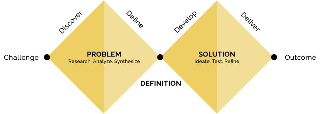
Discover
Domain Research
In order to get a better understanding of what travel apps and services were already available I dove in and researched the playing field. Not only did I look for what else was available, I also sought information about trends in the travel industry that could help shape my app. Here's what I found out:
• The travel market is driven by Millennials.
• 48% of experience bookings happen on mobile devices after travelers have arrived at their destination.
• However people still do preliminary research for their trips. Hotels are booked an average of 12 weeks in advance, and after that travelers begin to increase time spent on searching for experiences available at their destinations.
• The Tours and Activities sector of the tourism industry is growing faster than the overall travel market. More people are looking for adventure and things to do at their destinations rather than just visiting.
• Travelers prefer to use an app rather than a mobile website for every facet of planning a trip, but only 17% of travel brands say that they are focusing on investing in mobile app development.
User Inteview Insights
After I had a better understanding of the current state of the travel industry and market space, it was time to find out what travelers really want and need to have a great travel experience. So after reviewing a number of provided interview scripts, I pulled out the following insights:
• Users want authentic, tailored experiences when visiting different places.
• Users want to have researched, well-planned itineraries so they can focus on their experiences while traveling while avoiding disappointment.
• Users want trustworthy recommendations and reviews based on their interests, to guide their activity-planning.
• Users like curated lists of recommendations, preferably with a lot of images, because they often rely on visuals to help them make decisions while planning their itineraries.
Define
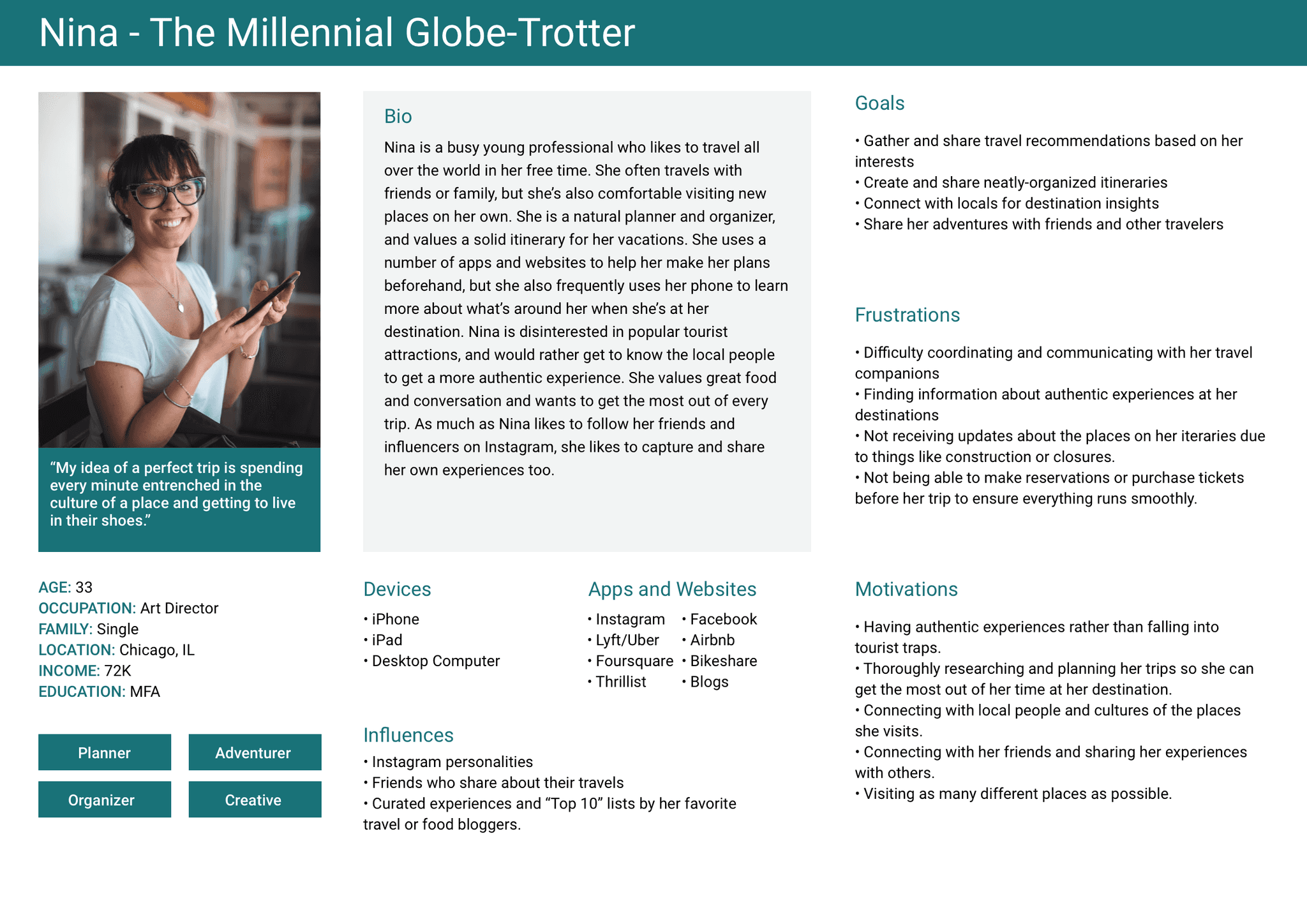
Forming a Persona, Informed by Research
Once I had a firm understanding of who potential users were and what they might expect and find useful in a travel app, I built my persona. My persona helped guide me throughout my design process because I always had "someone" to refer to when making decisions. Meet Nina:
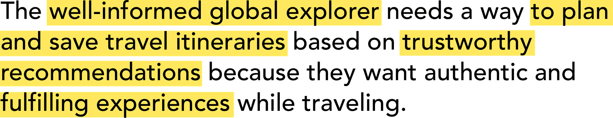
Defining and Refining the Problem
The next step of this phase of my design process was to bring the problem I would be solving into focus. With Nina at the forefront of my mind, I crafted my problem statement. It would serve as my North Star as I moved into ideating and exploring solutions for my travel app.
Develop
Imagining a Solution
After working through some brain-storming activities, I moved in to shaping a potential solution to my problem statement. I started by sketching out lo-fi wireframes so I could get a better vision of how the app might look, while also easily editing and making changes as needed. I scanned and uploaded my final set of sketches into InVision so I could really get a feel for how my user flow could work.
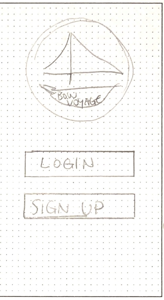
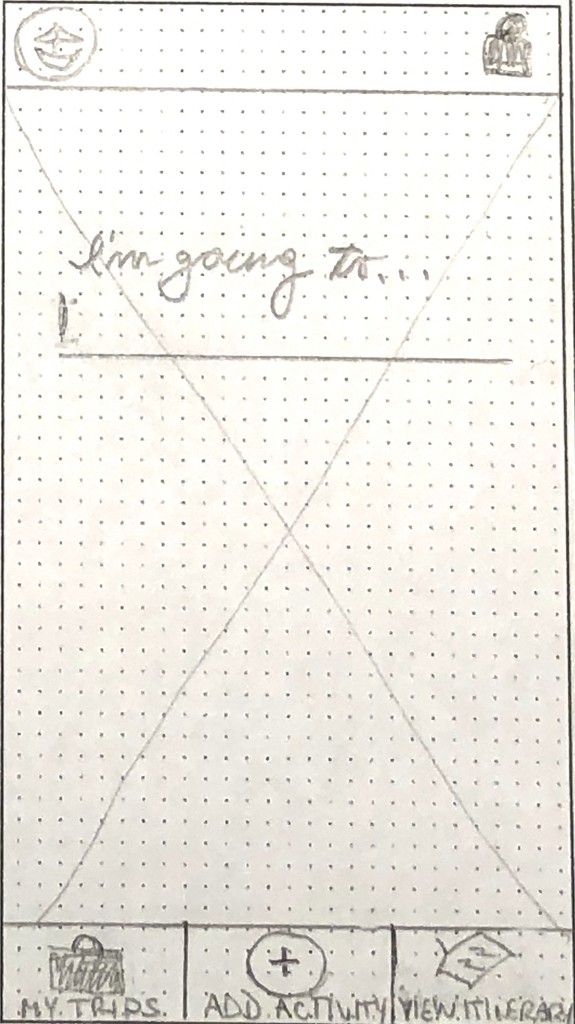
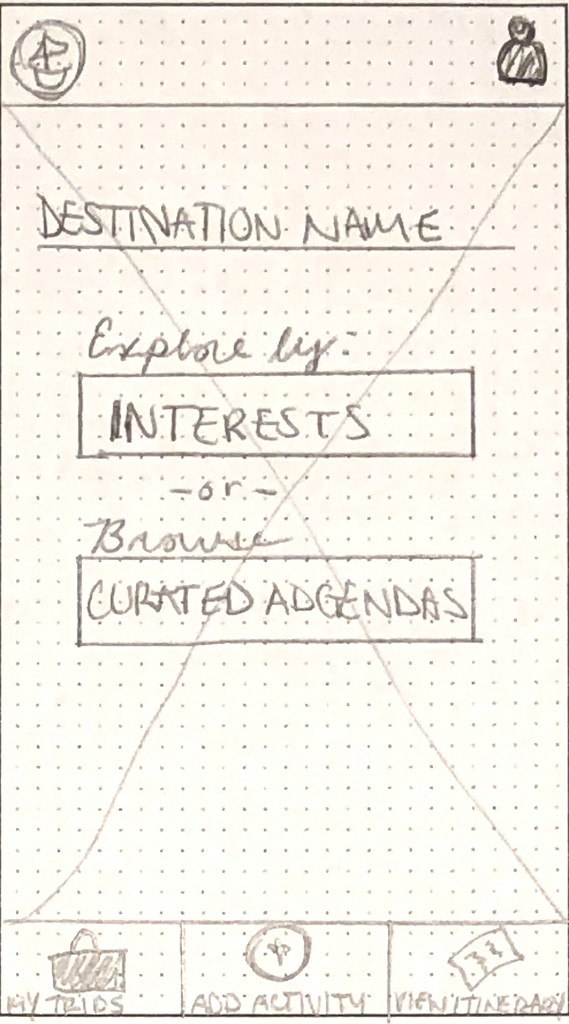
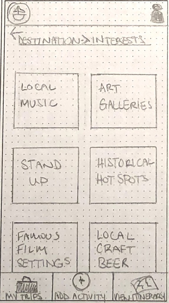
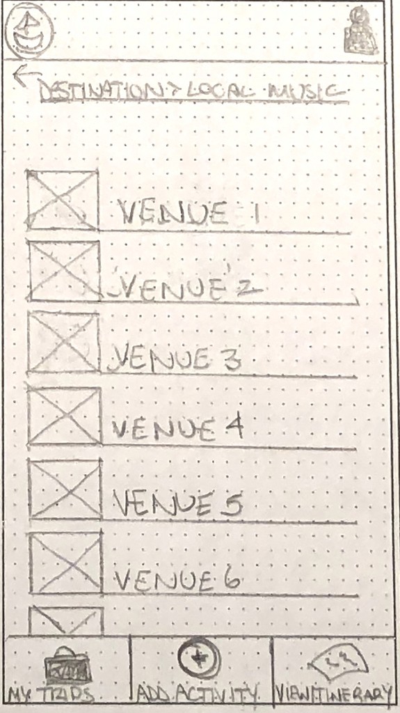

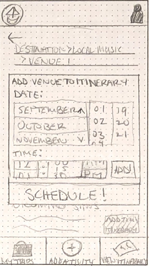
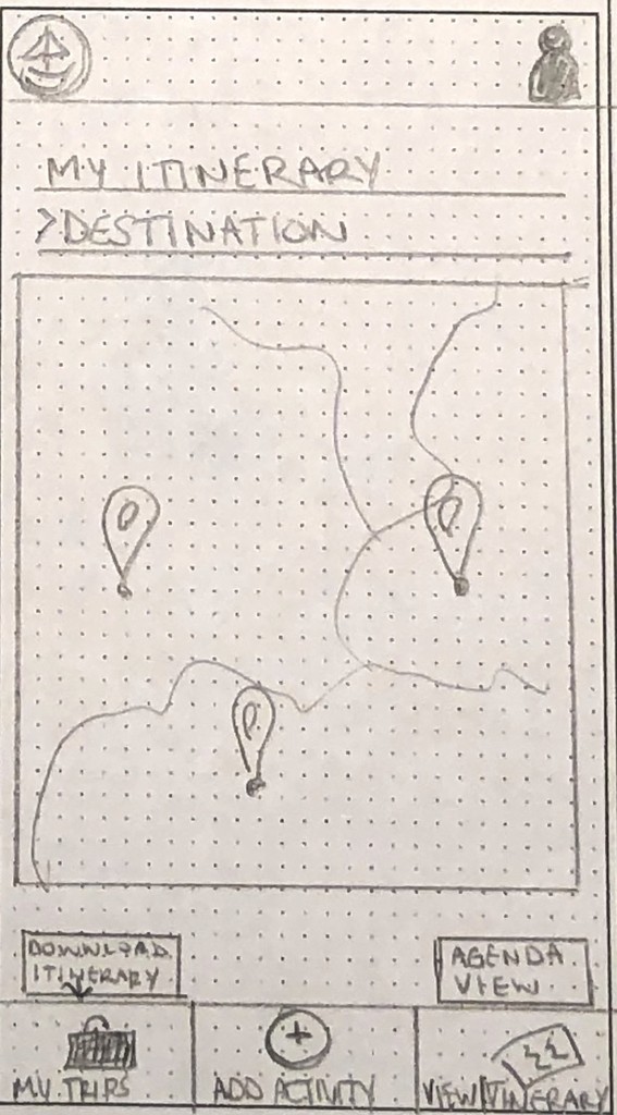
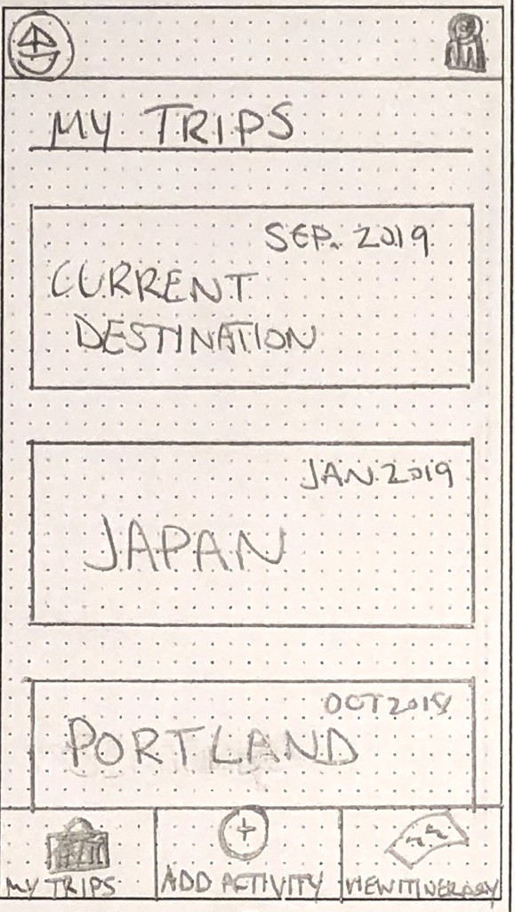
Going Mid-Fi
Once I felt I had worked out most of the kinks in my low-fi wireframes, I built my mid-fi wireframes in order to begin working out the spacing and iconography on a digital canvas.


Deliver
Finding Inspiration
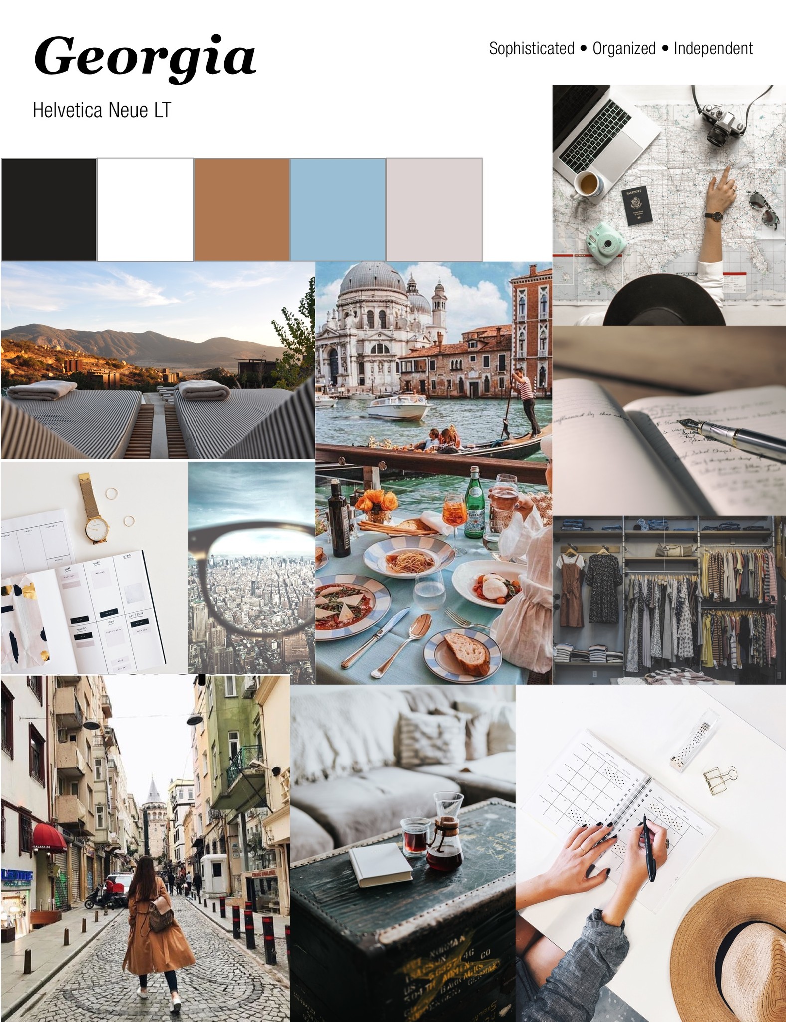
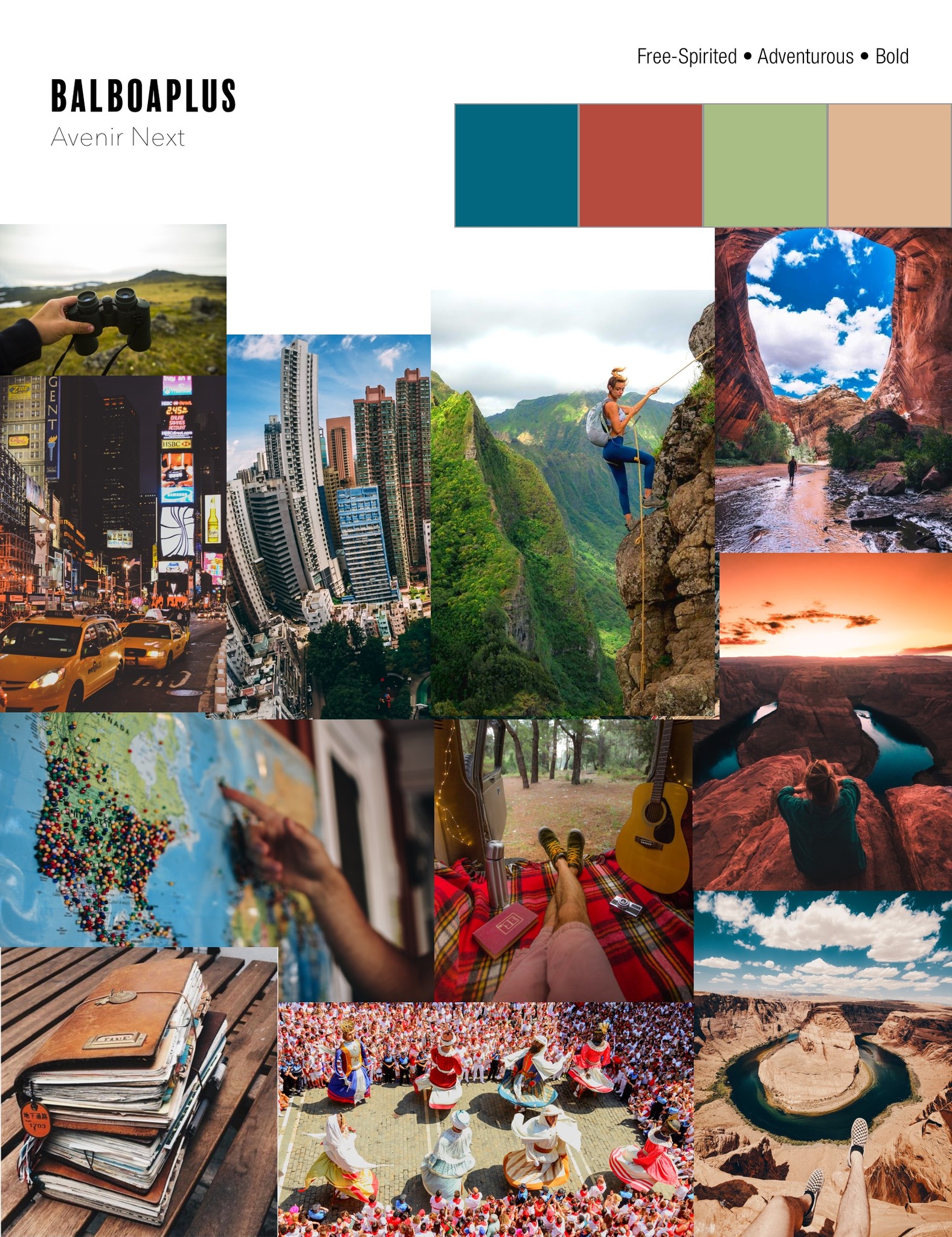
I wanted to find just the right look and feel for my exciting new Travel Itinerary App, so I scoured the internet to find inspiring images and began building moodboards. They each have a distinct feel and could appeal to different tastes within my target demographic. The first presents a sophisticated, reflective travel experience, and the second represents an adventurous, bold, and rich travel experience.
Developing the UI Elements for Bon Voyage
Once I had defined two different directions I could take, visually speaking, I moved into adapting each theme into UI elements for the app. I experimented with typography, icons, buttons, color palettes, button design, photography styles, and screen layout.
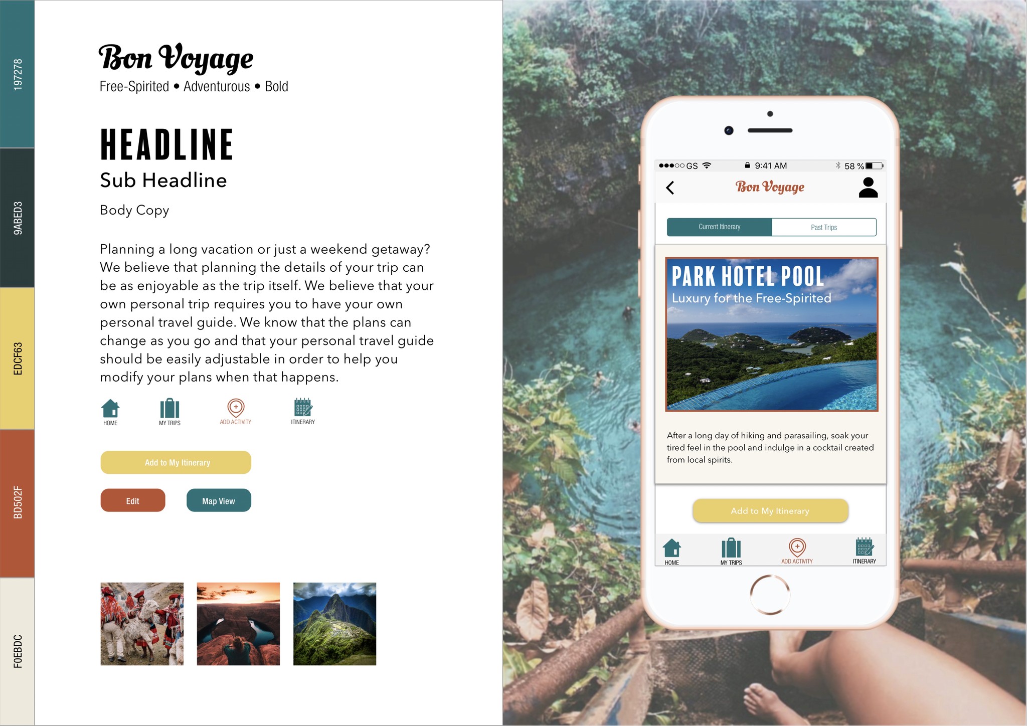
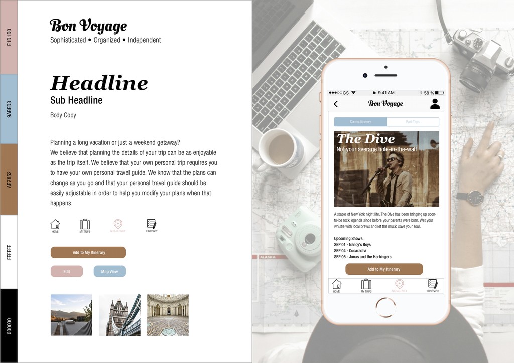
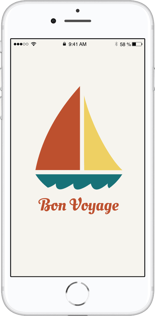
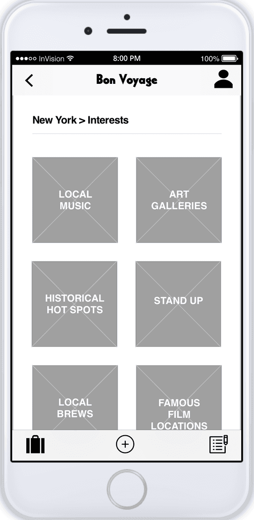
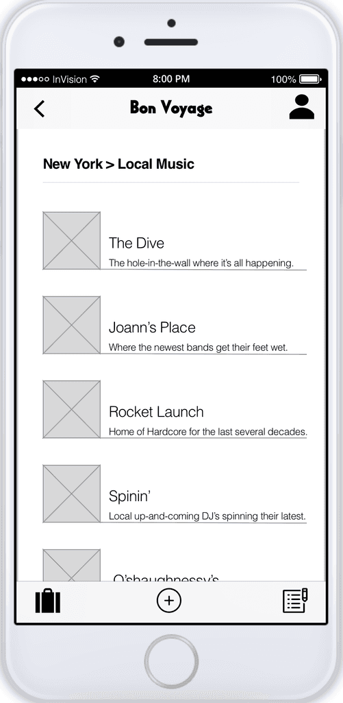
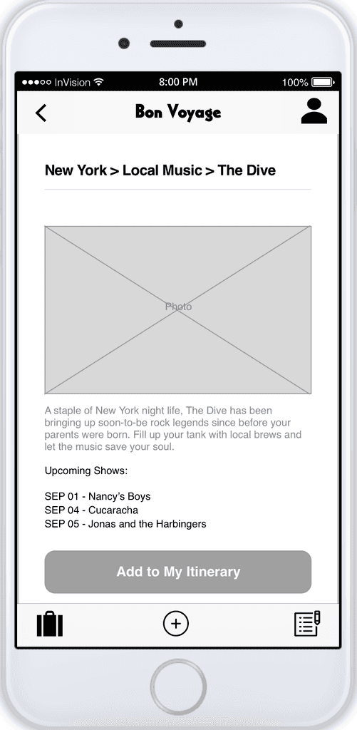
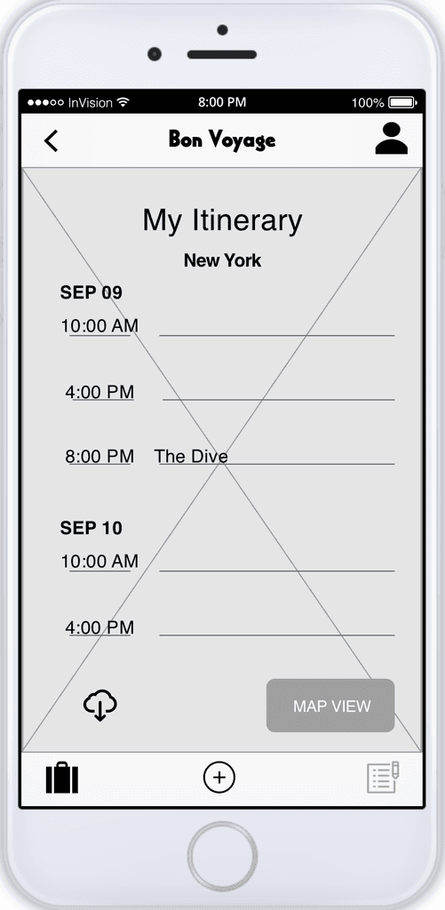
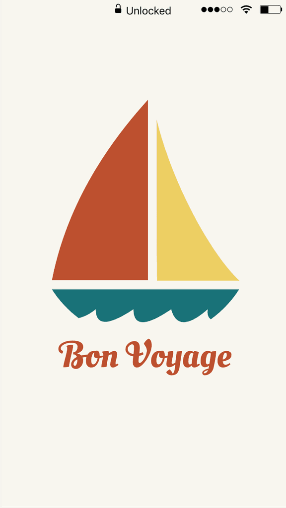
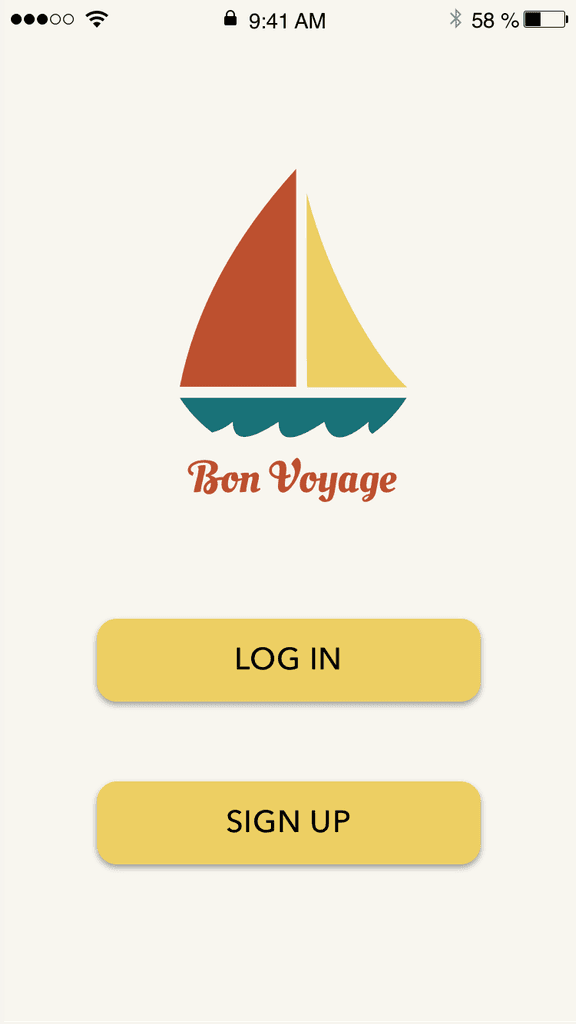
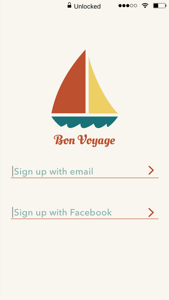
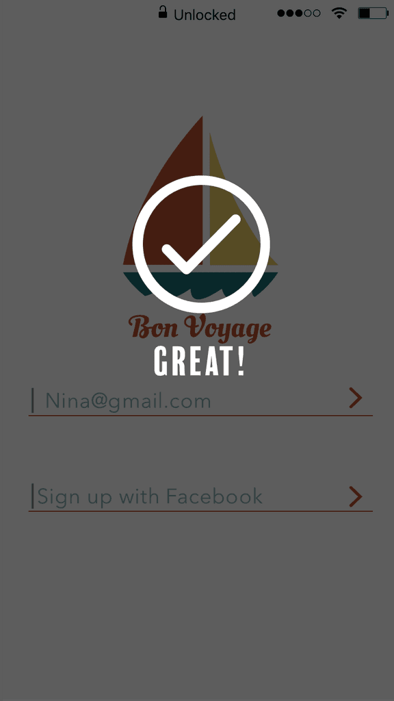
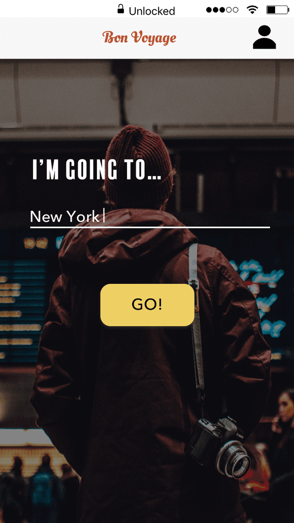
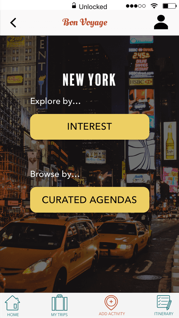
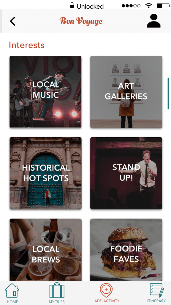
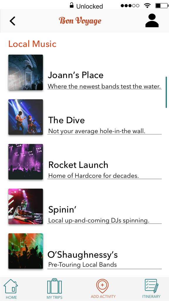
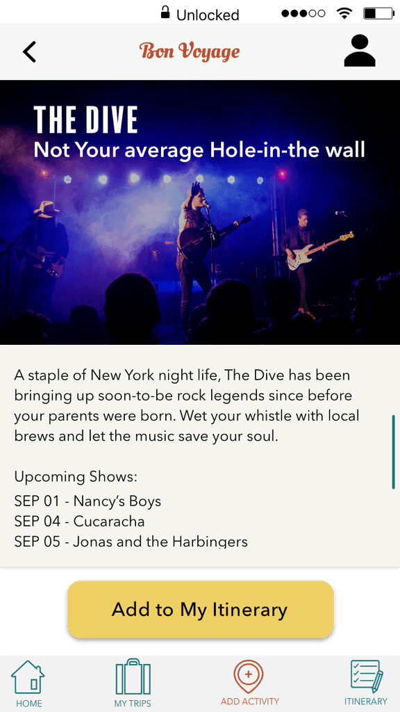
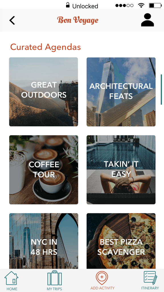
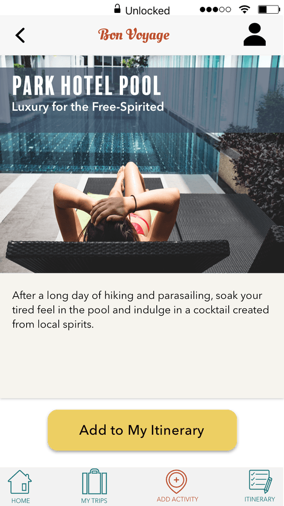
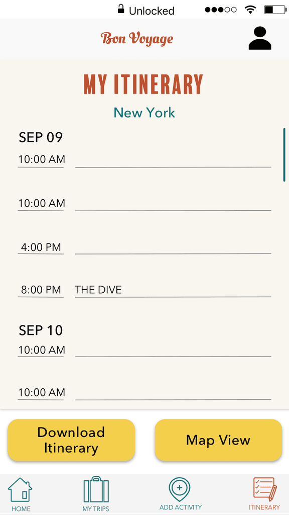
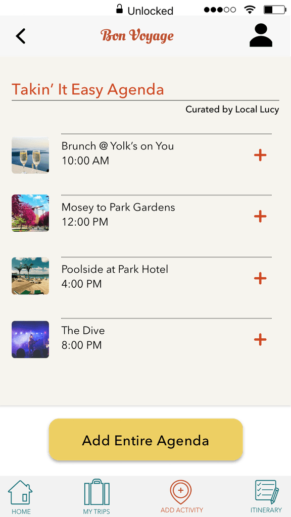
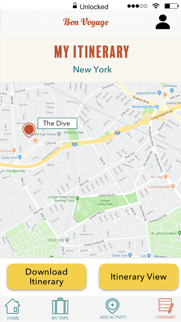
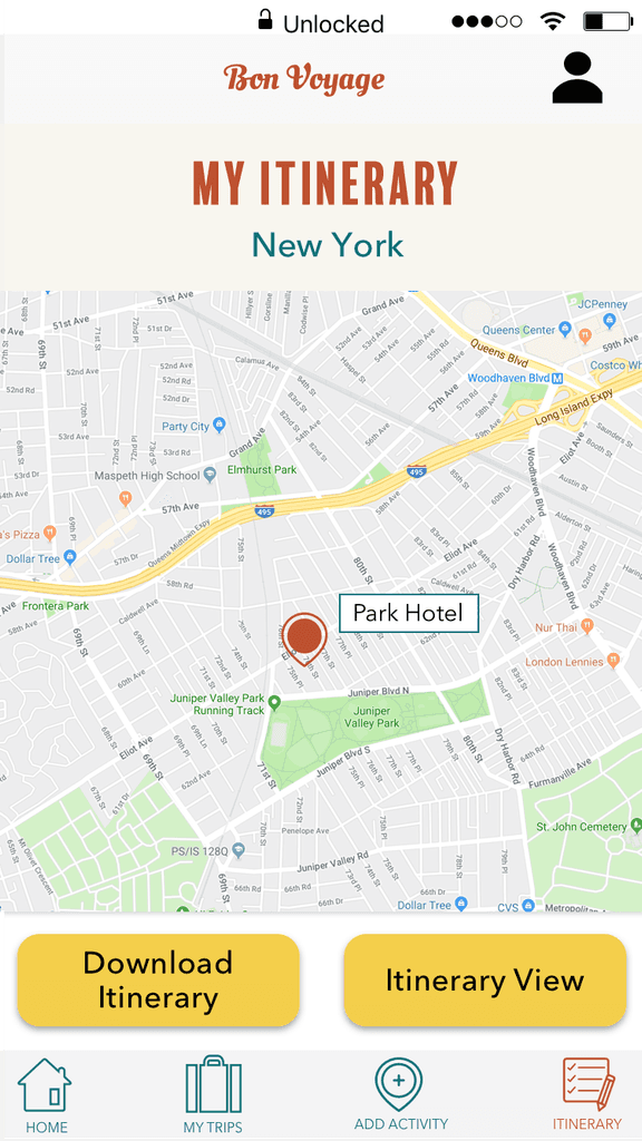
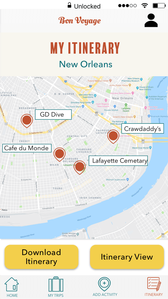
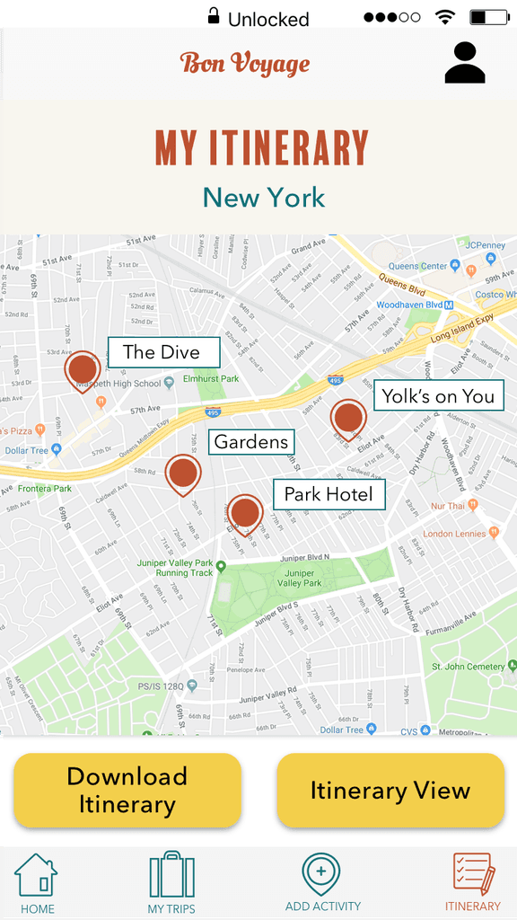
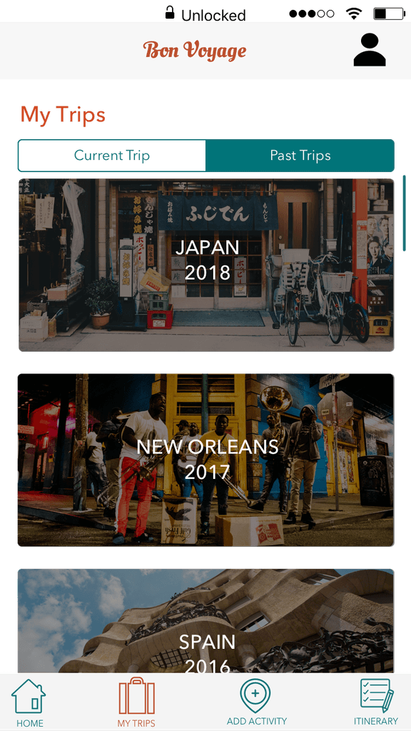
Without Further Ado…Bon Voyage!
Here's the final version of Bon Voyage


Final Thoughts
Reflection
I learned so much throughout the six weeks I worked on this project. Skills I developed with this project include: domain and user research, formulating a well-rounded picture of potential users based on research, how to work– and rework– my problem statement so it accurately reflects the needs of users, how to develop a visual design scheme starting with inspiration (with the user at the center of course!), some UI design basics, and how to think through the best way to bring everything together. Although there is always room for improvement and iteration, I'm quite proud of Bon Voyage. If I were going to continue to develop this app, I would do some additional usability testing with real people and dive back into my design process to build on what I've already created.