Oja Express: Responsive Website Design
Streamlining the ethnic grocery delivery experience
TIMELINE:
3 Sprints /
4 Weeks
ROLES:
UX Designer
UX Researcher
UI Designer
TOOLS:
Sketch
Figma
DELIVERABLES:
• Market Research • User Research • Problem Statement
• Design Principles • Heuristic Evaluation • Wireframes
• User Flow • Usability Testing • Style Tiles • Hi-Fi Prototype
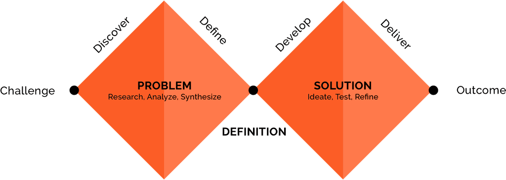
Design Process
The Challenge
About the Company
Oja Express is an online grocery delivery platform that specializes in same-day delivery of groceries from local ethnic grocery stores. Their goal is to be “the United Nations of groceries at your fingertips”. Oja Express currently partners with local groceries that specialize in African, Carribean, Latin American and South Asian cuisines. The business launched in 2016 with a mobile app. In the last year, Oja Express has expanded into a web platform.
How Do We Define Success for the Oja Express Website?
Our challenge was to update the site navigation and address overall site architecture in order to increase the ease of shopping and ordering groceries while decreasing confusion for users of the website. We wanted to build trust and improve the experience of shopping for ethnic groceries online through Oja Express.
Discover
Getting to Know the Market
Based on the research, we found that the direct competitors for Oja Express include Instacart, Mercado, Peapod, Kol Tuv Kosher Foods, and Chicago Metro Mart –because they either offer same-day delivery and pick-up service, connect independent grocery stores with consumers, and/or specializes in culturally-specific groceries.
However...only a few of these grocery stores or services specialize in delivering ethnic groceries, and of those that do, they are only delivering from one specific store. So there is a strong market opportunity for Oja Express because not only are they providing same-day grocery delivery, they also partner with multiple local stores to provide diverse ethnic grocery options to their end customers.
Getting to Know the User
“I’m a black woman, an African woman for that matter, so I grew up knowing about cooking. I cook for myself, for my family, for my kids, and my parents.”
Our clients sourced both current users and customers for our research. We interviewed 9 people who were mostly first-generation immigrants and their children, foodies, and skilled professionals. Many of them were of African descent, and currently shopped at local African grocery stores.
What We Learned from these Interviews:
• Many users assumed that others might have difficulty finding products based on the variations of product naming conventions, but they themselves did not currently have this issue.
• Users rely heavily on images of products to determine information about the product such as brand, specific item, etc.
• People who shop at grocery stores for items specific to their cultural background also regularly cook a variety of other cultural cuisines.
• People appreciate recommendations based on their purchases or the contents of their carts.
• Users do the majority of tasks and activities on their phones and often multitask. This also helped us determine that it would be best to build a mobile-first responsive website
What We Didn't Learn
While we really appreciated our client’s sourcing users for our research, we quickly found out that users we interviewed were biased in favor of the platform because of their personal ties to the company’s CEO. Additionally, many of them were already exclusively regular users of the mobile app, so we weren’t able to gain deeper insights related to their use of the website as we had hoped.
So, I Got Scrappy!
Because our data from the initial user interviews was skewed, and we weren’t able to get a clear enough picture of the challenges a new user might face on the current Oja Express website, I decided to source some of my own users and perform guerilla-style usability tests. My team and I met with eight people who had never heard of Oja Express and asked them to perform a few select tasks on the Oja Express desktop and mobile website.
From these interviews we learned that users:
• Had problems browsing or searching for items because they didn’t see the product category section, they didn't have the search terms return expected results, and they weren't able to differentiate between search results and a list of recommended items.
• The cart review and checkout process was not very streamlined because it was difficult to update quantities in the carts, and delivery availability verification didn’t happen until the very end of the process.
Define
What's the Problem?
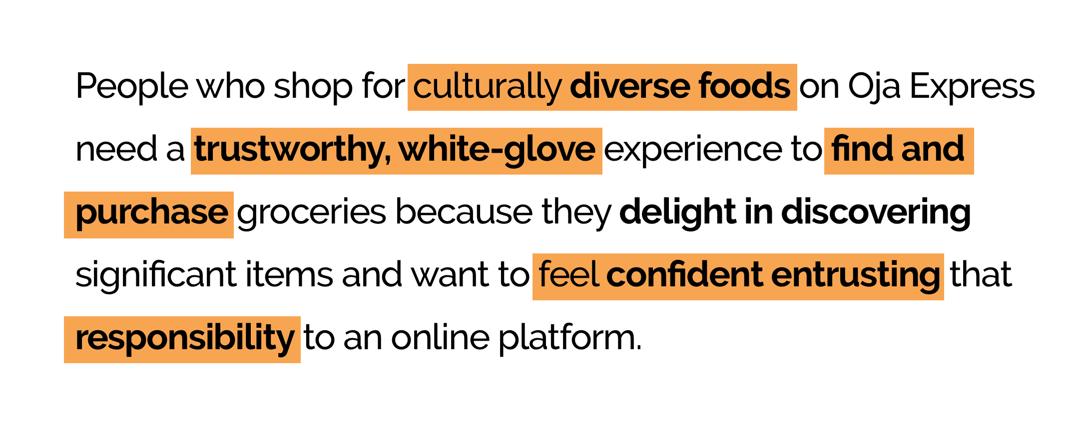
We took our synthesized information and carefully crafted a problem statement in order to specify what we were solving for on behalf of the user including their needs and motivations.
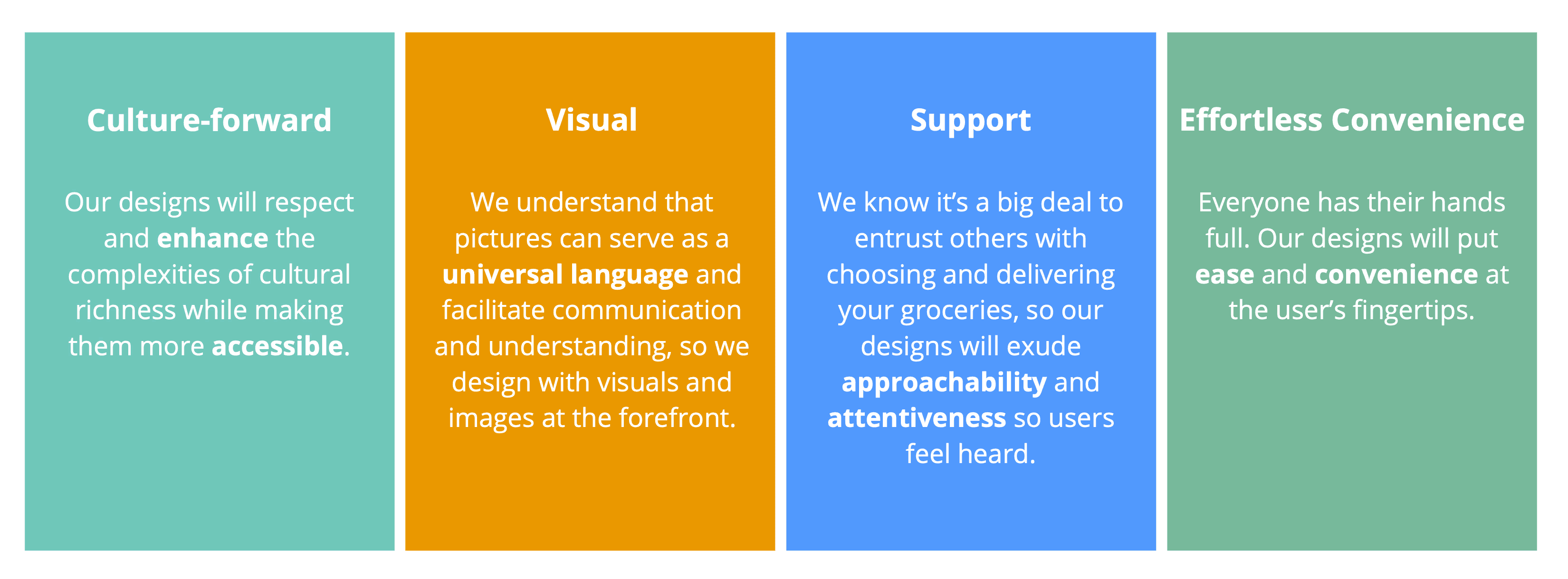
Design Principles
Along with the problem statement placing the user at the center of the whole project, we also defined our design principles that we would use to guide us throughout the entire design process to make sure our future solutions would uphold these user-centric pillars of success.
Develop
Sketch It Out!
Through the Ideation phase, together we brainstormed and sketched out over 90 ideas. Then my team and I narrowed them down to a few concepts to refine further and test with users.
One of my ideas was to focus on how people physically move through the grocery store and try to adapt that to a digital environment in order to make it easier for people to plan and organize their grocery list.
Observations to Leverage
There were aspects of each concept that were well-received and worth considering incorporating into our final product.
• People especially appreciated features that helped build a sense of community.
• People will either browse or search for specific items and have expectations for both of those methods. Each agenda should be met in our final product.
• Representation matters. When people see products from their home-countries, they feel included and represented.
• People do not want to be inundated with too much information at once.
• Overly-complicated processes deter people from using the platform, especially on a mobile device.
“It seems to draw me in as an audience who’s now acknowledged, so it feels inclusive.”
Deliver
Working Out the Details - Heuristics Evaluation
In order to fully understand some of the usability issues on the Oja Express website before we integrated our concepts into our design, we performed a heuristics evaluation of the current Oja Express website– both to inform some of the easily-fixable details that were within our project scope and to provide recommendations for future website buildout and fixes.
Stay Analog Now, Save Time Later
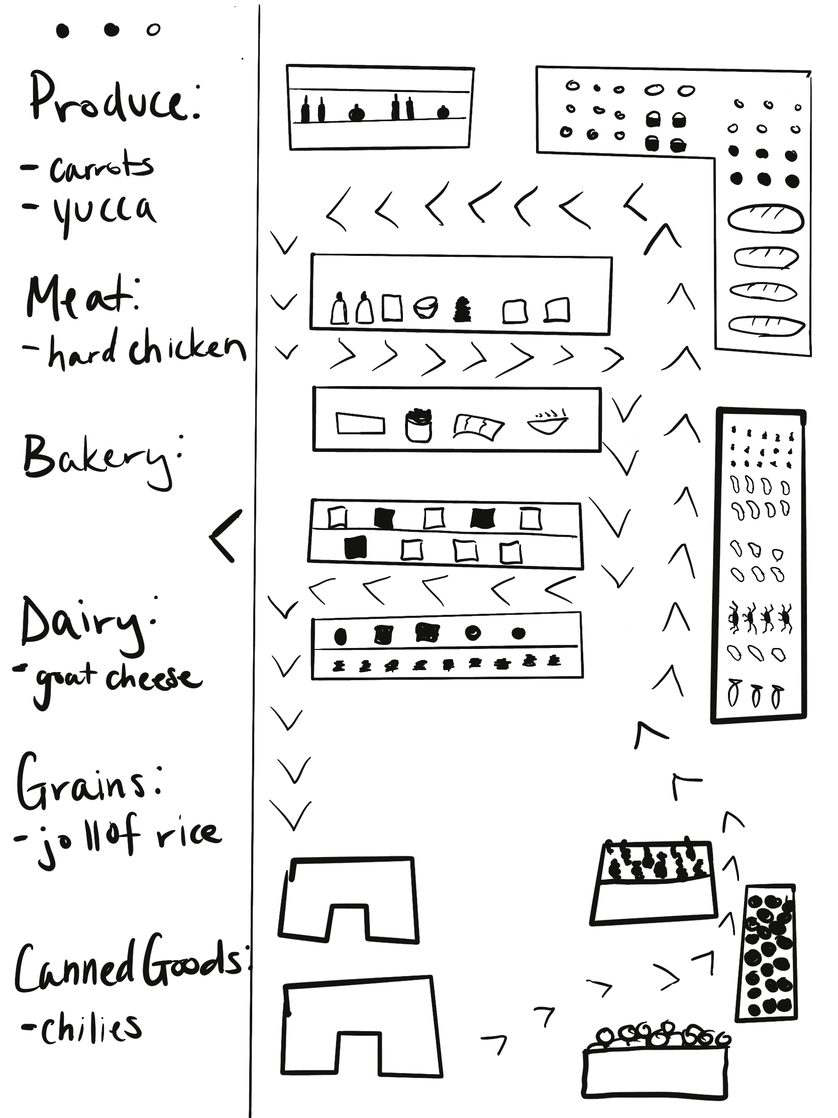
Armed with our problem statement, design principles, concept testing results, and heuristic evaluation, we sketched out site architecture and key screens on whiteboards and paper. We made sure to wait as long as possible before taking our designs digital because we wanted more flexibility in working out some of the finer details and design patterns. We even created paper prototypes to do some quick and simple usability tests to make sure we were on the right track with our design before building the prototype on Figma.

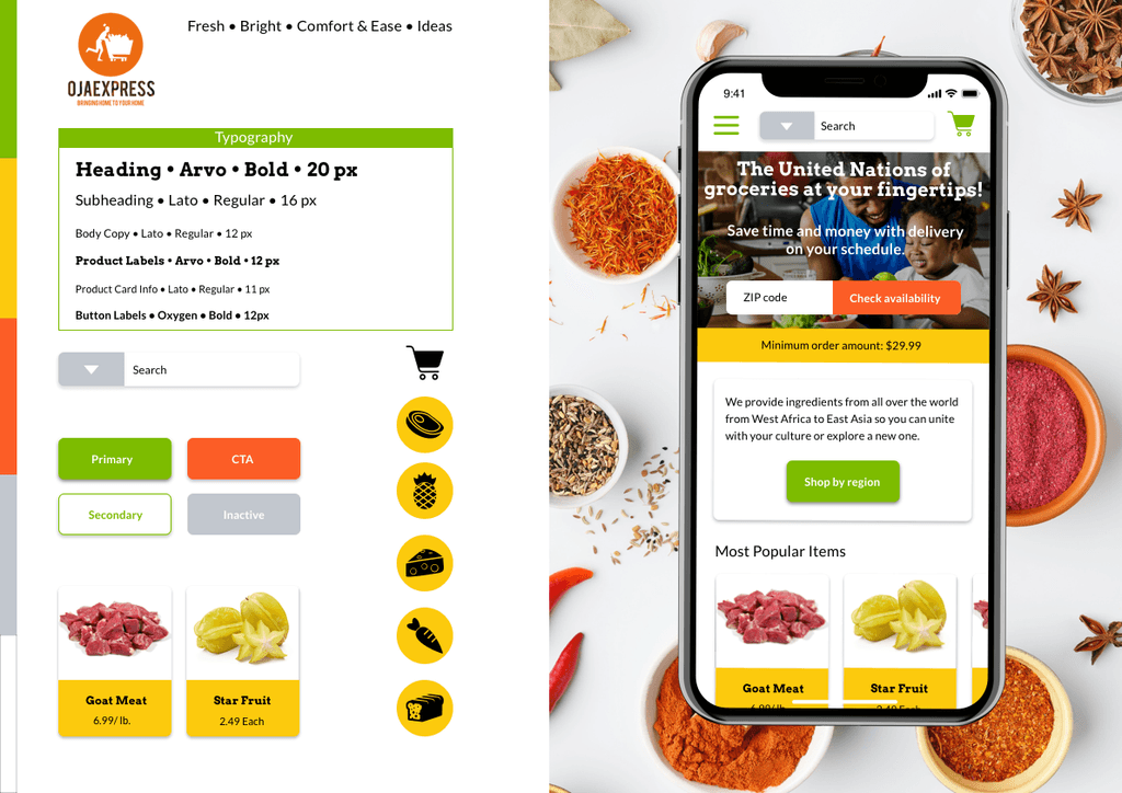
UI - Creating a Look and Feel for Oja Express
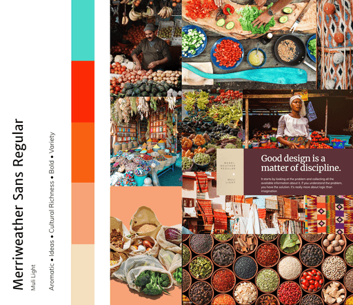
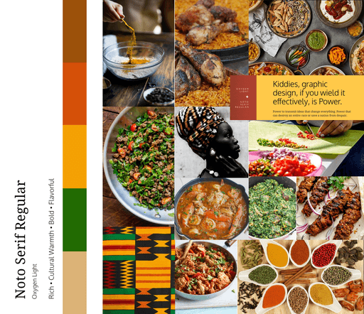
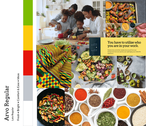
I wanted to develop a visual and interaction system that is culture-forward, visual, and effortlessly convenient–based on our the design principles that were defined for this project. So I started by exploring different images and design elements that could be incorporated into a hi-fidelity prototype.
First, I built three moodboards for the Oja Express website:
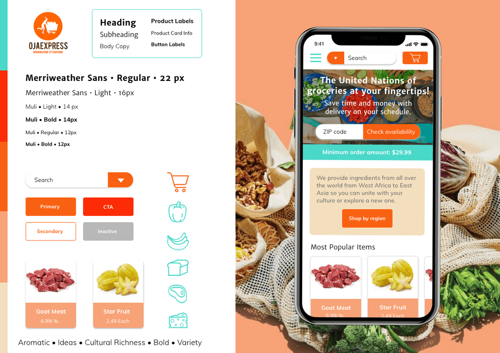
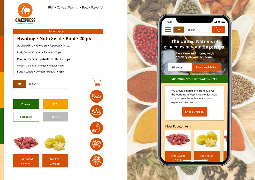
Next I refined these ideas, including the typography and color palettes into three style tiles:
Putting It All Together
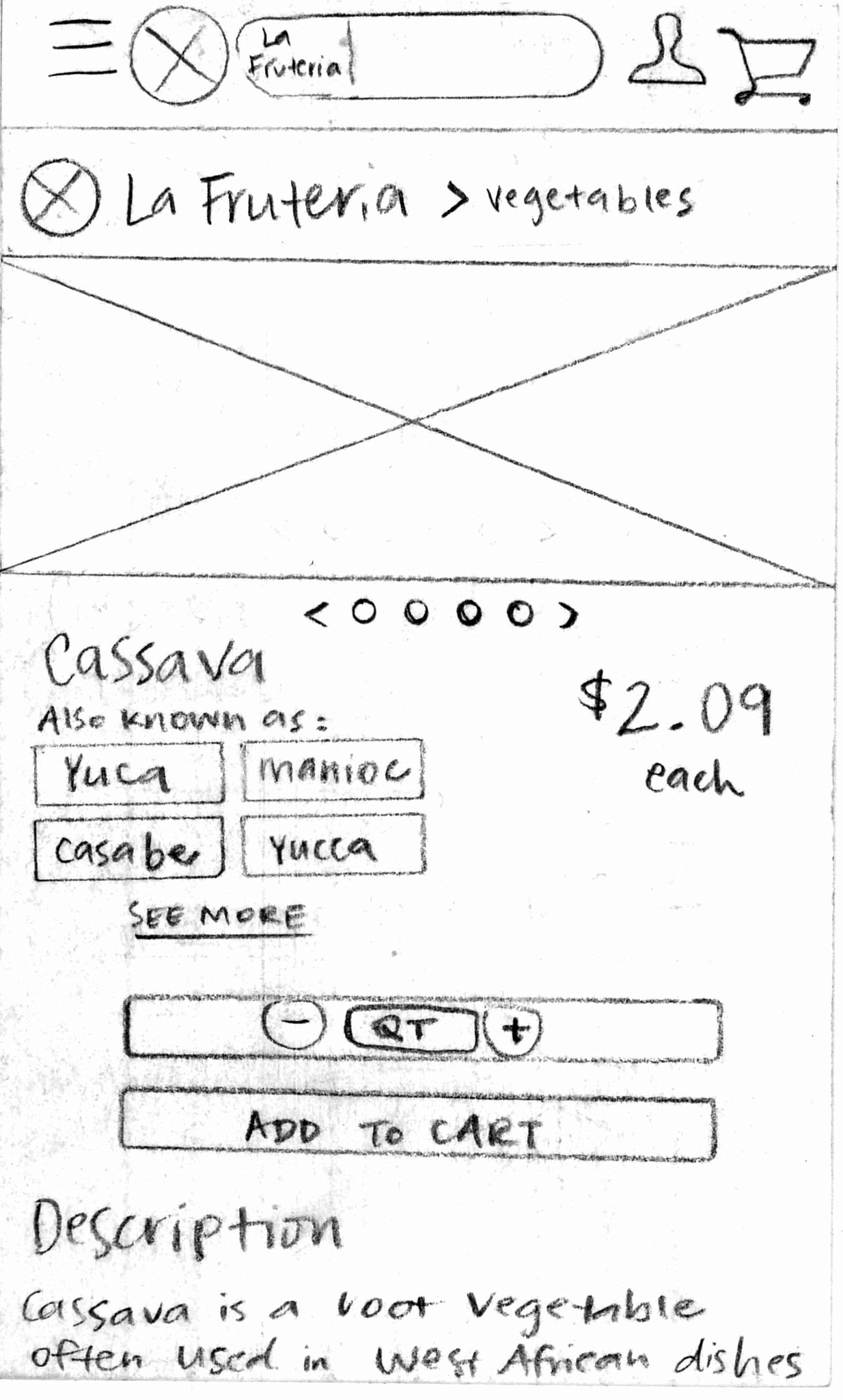
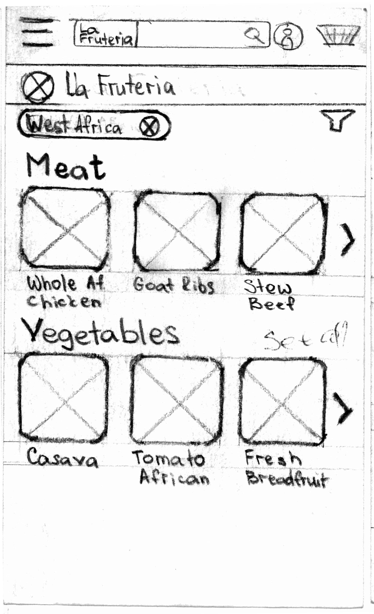
Finally, once all of the details were worked out in the paper wireframes, and I knew how I wanted to implement my design elements on the Oja Express website, I built a hi-fidelity prototype.
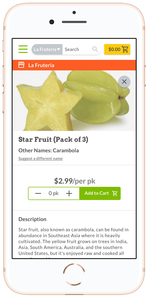
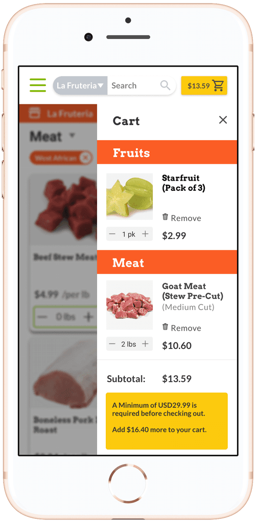
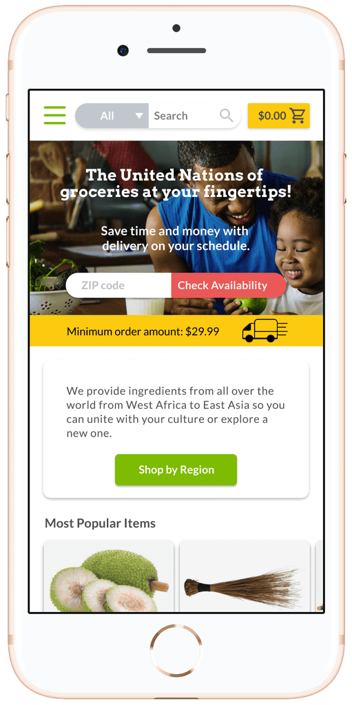
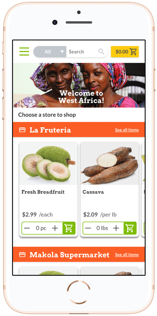
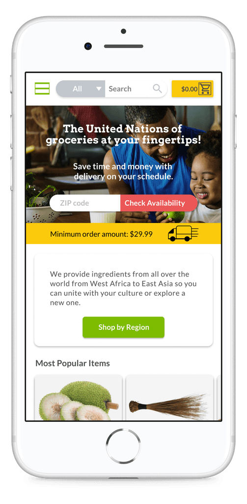
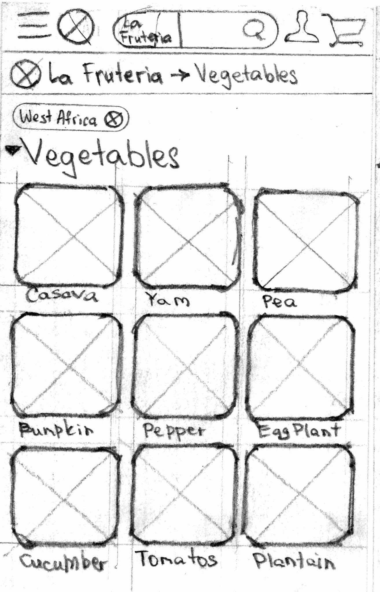
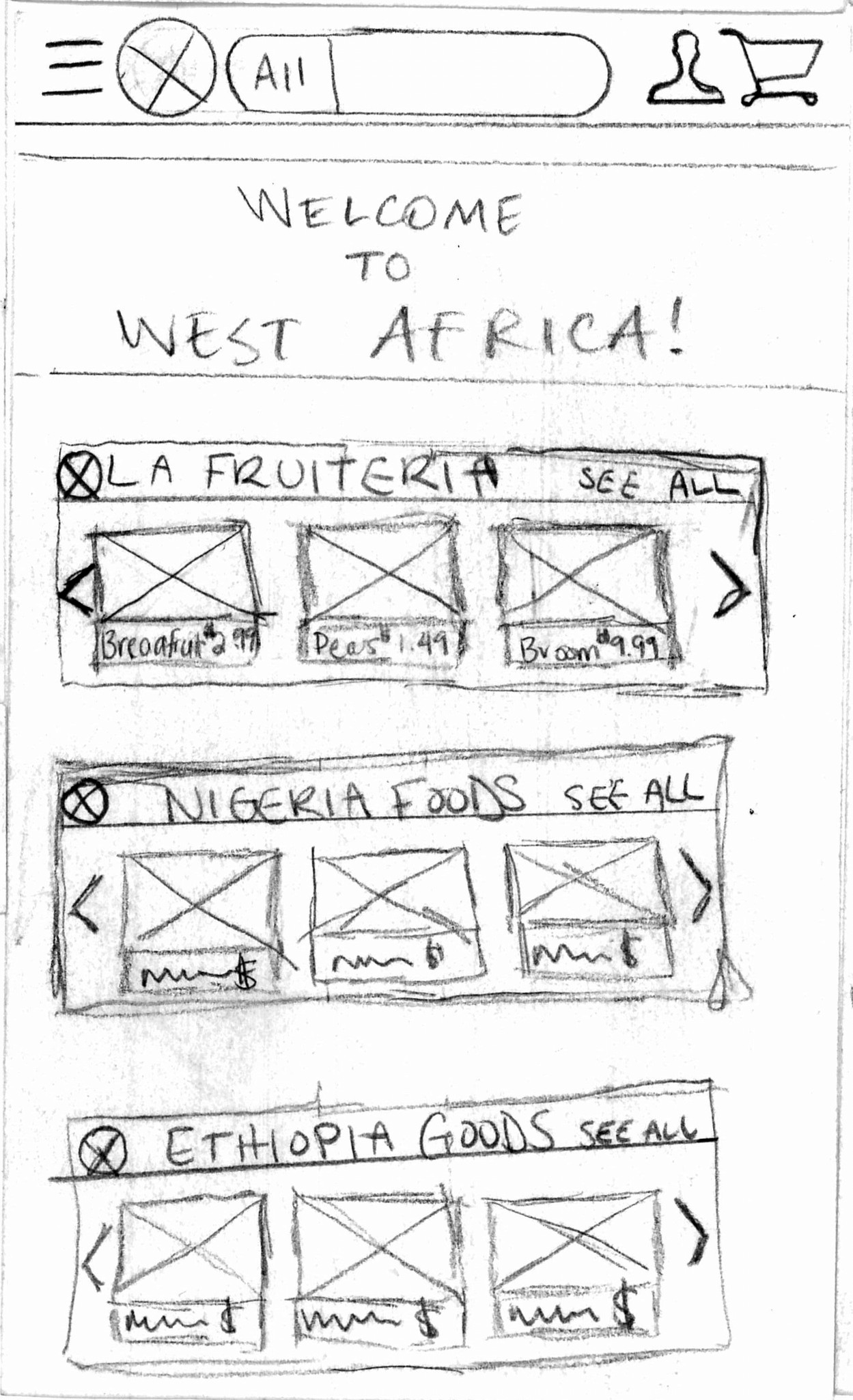
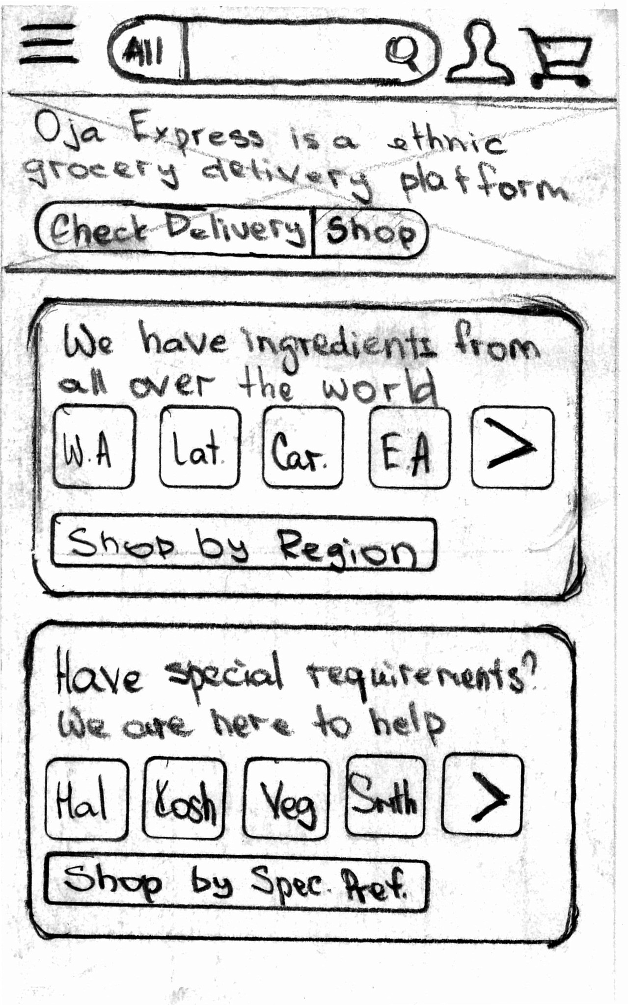
Presenting the Oja Express Mobile Website
This prototype accomplishes three key things:
• It brings the delivery availability verification to the top of the home screen.
• It gives users the ability to shop by region.
• It affords users the ability to browse the site by categories, beginning with various entry points
• It gives users the ability to choose preferences for meat cut or produce
• It makes the cart review truly glanceable
With this prototype we also worked out a lot of the navigation issues from the original site including:
• Organizing the top navigation by moving links that were not relevant to the primary user to the bottom navigation.
• Providing multiple cross-referenced entry points for browsing.
• Limiting the viewable products to a specific store after the first item is selected in order to avoid the users adding items from multiple stores to their cart (something the clients specifically wanted to avoid for now).
Make Sure It Works for the User
In order to make sure that the design effectively solved the problem statement and met the needs of the user, we performed another round of usability testing on four main task scenarios with 8 users. We found that there were very few usability issues and 100% of users were able to successfully complete each task scenario with few to no errors, averaging 45 seconds per task. Score! So we made a few minor adjustments and wrapped up our final design to present to the client.
Outcomes
Oja Express Plan for Implementation
The clients have already begun to implement much of our design over the past few months. For example, they have updated the site architecture, incorporating many of our suggestions, and added features like meat cut preferences on relevant product pages–which already greatly improves the user experience. I look forward to seeing how Oja Express continues to grow!
Reflection
Working with the Oja Express founders on their mobile website was an incredibly rewarding experience. I learned about finding solutions that keep the user’s interests at the center of the design process while staying in line with the client’s needs and vision for their company. I also gained a better understanding of how to manage the scope of a project to ensure that we were able to focus on the most crucial elements of the work in this phase, while still creating valuable and meaningful designs that would positively impact the business.